3 important takeaways from Google’s
Foundations of UX Design course

I had been eagerly anticipating the release of Google’s UX Design Professional Certificate on Coursera for nearly 8 months when I finally received the nonchalant e-mail announcing it’s arrival. Like many others invested in learning more about UX design, I was intrigued by the great price point of Coursera compared to the other boot camp options out there that ranged from a few thousand dollars to upwards of nearly 20k. I had done a bunch of self-study and a random assortment of classes from various corners of the internet, so I was hopeful that the Google UX Design Professional Certificate would provide some context and structure. The Certificate is made up of 7 courses, and after completing the first course, Foundations of UX Design, I am not disappointed! Here are my 3 biggest takeaways:
1. Be inclusive by default
Years ago, when I was a new teacher, one of the first things I learned is that my students’ successes are my own success, and my students’ failures are my own failures. If I teach something in a way they can’t understand, the responsibility is on me to get better at teaching. If I teach something in a way they all understand except for my one autistic kid and my one kid who is behind in their reading skills, the responsibility is still on me to get better at teaching.
Although my teaching career ended several years ago, I have carried this lesson forward with me. The responsibility for accurate communication through my design to my end users falls on me. In The Design of Everyday Things, Don Norman writes:
“The idea that a person is at fault when something goes wrong is deeply entrenched in society. That’s why we blame others and even ourselves. Unfortunately, the idea that a person is at fault is imbedded in the legal system. When major accidents occur, official courts of inquiry are set up to assess the blame. More and more often the blame is attributed to “human error.” The person involved can be fined, punished, or fired. Maybe training procedures are revised. The law rests comfortably. But in my experience, human error usually is a result of poor design: it should be called system error. Humans err continually; it is an intrinsic part of our nature. System design should take this into account. Pinning the blame on the person may be a comfortable way to proceed, but why was the system ever designed so that a single act by a single person could cause calamity? Worse, blaming the person without fixing the root, underlying cause does not fix the problem: the same error is likely to be repeated by someone else.”
― Donald A. Norman, The Design of Everyday Things
This concept has huge implications for design, for our society, for social justice and equity. What if more people took responsibility for the systems? What if designing for humans in spite of these systems was a responsibility that all UX designers accepted?
In a three-part article written by two Google UX researchers, a myriad of considerations for designing in the context of bigger systems and cultures are examined. The researchers call upon designers to keep the following set of considerations in mind:
- consider varying abilities in vision, mobility, and precision
- consider that common knowledge varies widely between groups
- consider intermittent data availability and offline usage
- consider environmental factors such as sun and shade
- consider how widely the meaning of certain colors varies across cultures
- consider the number of people who use devices with a cracked screen
- consider all screen sizes including small, low quality screens
- consider the cost of data in markets around the world
- consider privacy options on devices shared by multiple people
- consider those who can’t read in any language
- consider those without credit cards
In some cases, these concepts may be considered more important in emerging markets. The articles provide examples, however, proving that use cases for these design considerations are present all around us. The take home message? Inclusivity by default will allow a better user experience across all markets.

2. “Fail often in order to succeed sooner”
Having facilitated many project-planning workshops for students in the past, learning about the design sprint felt familiar; the itinerary of icebreakers, goal setting, ideating, decision making, prototyping, and seeking feedback was exactly the model that I used with my students. And it worked so well! Although their projects were social justice-oriented, it got them working together, thinking outside of the box, and bouncing big, small, and silly ideas off each other. I always loved the energy in those workshops, and although they took a lot of planning, they were a joy to facilitate.
As someone who thrives in collaborative environments and loves the camaraderie that comes with creative groupwork, the idea of participating in a design sprint sounds exhilarating. “Fail often in order to succeed sooner” is a quote that has stuck with me since I first heard it in an urban design class in college, and one that I am excited to bring to my learning about UX design! If the sprint mindset tells us one thing, it’s that designers should spend less time thinking and more time doing since that is the fastest way to get to the best iteration of a project.
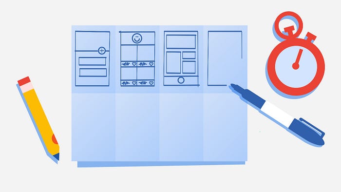
Foundations of UX Design immediately throws learners into doing with our first UX project: creating a portfolio! Which brings us to takeaway #3…
3. DO go down the rabbit hole with your portfolio
Foundations of UX Design didn’t actually provide a ton of guidance on portfolios, so I (a newbie UX designer, lacking industry common knowledge) combed the web to learn more.
There are many articles written by those who hire UX designers on what they are looking for in candidates, what will get you an immediate rejection, and what you should do with your portfolio. While there’s a ton of super important, detailed advice in these and similar articles, one overarching theme stood out: A portfolio is just as much an example of one’s UX skills as the case studies in it, and it won’t get me very far unless it provides hiring managers with a great user experience.
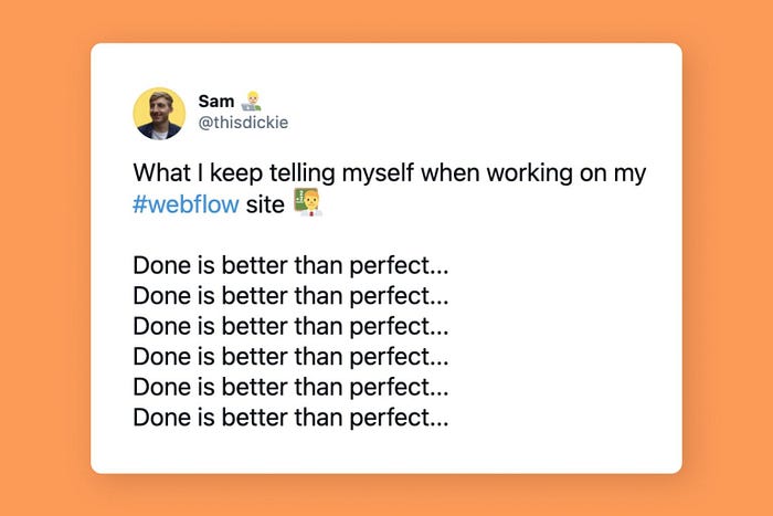
Firstly, customization in one’s portfolio matters. Hiring mangers, who look at hundreds of portfolios, often see the same templates and stock images over and over. This sounds incredibly boring. So I chose Webflow as my portfolio platform because of it’s infinite customization options and room to grow in my design skills. With only a very basic working knowledge of HTML/CSS, I charged forward, watching hours of Webflow University videos. Fear not if you have zero working knowledge of code — if you can spend a few hours watching tutorials, the basics are easy enough to pick up.
Secondly, I scoured the web, studying the portfolios of successful UX professionals and students alike. I Googled people and sifted through my LinkedIn network, bookmarking portfolios I liked and taking note of things I didn’t like. I also dug through Webflow’s collection of templates available for purchase because you can open them for free in the designer and pick apart how they were built. I put myself in the mind of the user every time I opened a new portfolio, and that has taught me a lot about how I want people to feel when they open my portfolio.
Finally, published is better than perfect. My portfolio will never be done, and certainly never be perfect, and that is okay! It will, of course, evolve with my work, my skills, and my knowledge. But there comes a point where I have to buy the domain name, hook everything up, and just click “publish”.
And because a portfolio is a UX design project, it is important to request honest feedback from anyone who will look, especially fellow UX-ers . Bring a growth mindset to the table and don’t be afraid to make changes when you hear new feedback!
How are you liking the Google UX Professional Certificate so far? What are your most valuable takeaways?
See the Google UX Design Professional Certificate on Coursera here. And feel free to connect with me on LinkedIn as well!

